Tools: Sketch, Paper Prototyping, Invision, Balsamiq
Involvement: I worked on a team of 5 designers to research, test, prototype, and design this app for a course, INFO 3450 Human-Computer Interaction Design
A vibrant community is dependent on diversity. Yet when it comes to the everyday interactions university students have with one another, it is not uncommon to see divisions in academic and social experiences along lines of cultural, ethnic, and geographic backgrounds. Our team decided to address the challenges faced by international students specifically in their social and academic pursuits.
We anticipated that English language barrier would be a dominant problem that international students face. We had expectations of other problems including such as making friends, homesickness, and cultural assimilation.
User Research + Synthesis
In our first phase of user research, we performed Contextual Interviews with both domestic and international students. While domestic students were not our target user, we sought to study the dynamic between domestic and international students: what generalization and opinions they had of each other and what social encounters or relationships they had. We collected our findings and created an affinity diagram with nine distinct themes regarding social, cultural, and academic dynamics and interactions between international and domestic students, which included topics like foreign language experience, and english language, academic relationships, communication, homesickness. In collecting our findings, we discovered distinct themes within Some key points include:
- Language barrier is not as big of a problem as we thought. Many international students attended international schools or had English classes in primary school. They had difficulty with English in only very specific settings, such as very casual or very professional manners.
- Differences in cultural norms made social experiences anxiety inducing. From navigating bus routes to classroom etiquette, learning American customs were challenging but necessary for student life.
- Social goals are personal. Some actively sought domestic or international friends, some didn’t, but most were open to meeting new people. Regardless of domestic or international status, students had very unique and specific social goals.
- There’s a stereotyped social divide between domestic and international students. DS agreed that they’d “feel out of place” among international students. International students agreed that IS students tend to stick together as well, particularly those from the same country or geographic region.
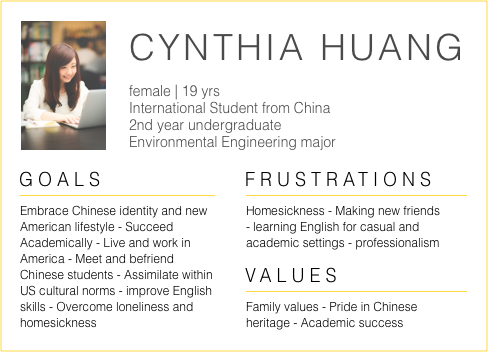
While there’s psychological and sociology evidence behind this, some international students have very close friends who are domestic. International and domestic student interactions can potentially have a significant and positive impact on their social lives. We created a persona based on these findings, and the prominent goals, frustrations, and values of our ideal user.
 Persona
Ideation
When generating ideas, we asked how might we address the user’s current frustrations and goals in the context of current behaviors? After 100+ ideas between our team, we decided on a social application to create and join food related events such as potlucks or shared meals.
Tasting authentic dishes and exposure to food customs is a unique way to learn about other cultures while meeting new people. International students can befriend other students from their country, or meet domestic students to learn and assimilate within American culture. Meals can be tailored to meet each individual’s social goals. Potlucks can have varied levels of intimacy depending on how many guests there are. And, for some reason, college students are always looking for food.
 Low, Medium, High Fidelity Iterations and Evaluations
We designed and evaluated iteratively, from low fidelity paper prototypes to medium fidelity wireframes on Balsamiq to high fidelity interfaces and interaction with Sketch and Invision. I worked closely on implementing how users browse, join, and create potlucks.
1. User Flow: Join Potluck
 Medium Fidelity Flow on Balsamiq
 High Fidelity Flow on Sketch and Invision
When creating the flow to join a potluck, I considered:
- What does the user need to know to make the decision to join the potluck
- How can we encourage the user to join and contribute From medium to high fidelity, I decided to constrain the user by simplifying the flow. Only after deciding to join the potluck does the user decide how to contribute. Each of the three options are clearly presented as buttons. Through wording and hierarchy, we sought to encourage users to contribute either by preparing a dish or providing money. I kept the recipe feature, but displayed it as an overlay so it wouldn’t disrupt the flow. I also put the action button near the top, so that the user could read the recipe if he/she wanted to, rather than forcing it to be read.
2. Designing Lists
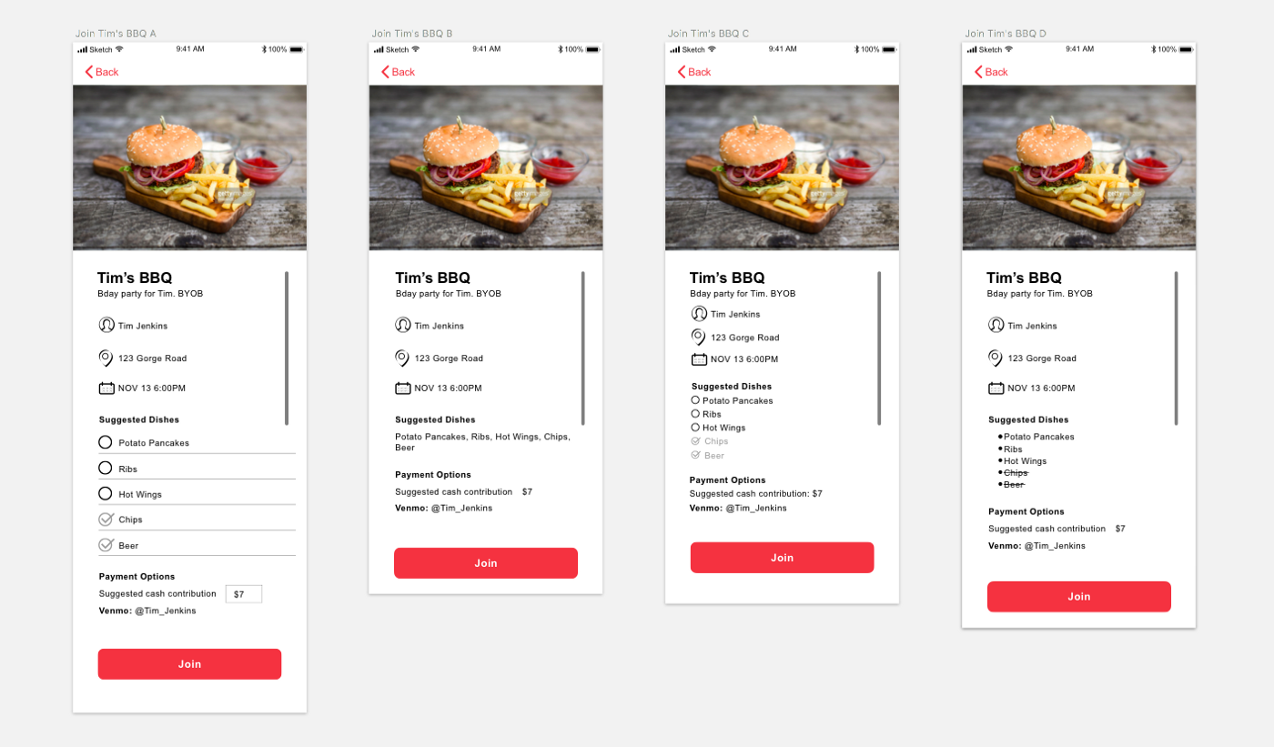
 Explorations for “Suggested Dishes” List
Through user evaluations we found at that the list of suggested dishes in our first high fidelity iterations (Version A) looked too “clickable”. At this point in the flow, we wanted to convey which dishes were being brought, of the list of suggestions. I did want to distinguish those that were already being brought, to promote a participatory feeling, even before the user decides to join.
Of the above explorations, inline text in Version B didn’t convey distinction and the strikethroughs in Version D were unfamiliar to users. Thus I went with C: the smaller circles and condensed spacing made these options less clickable while still conveying the necessary information.
3. Content Design: Call to Action Button
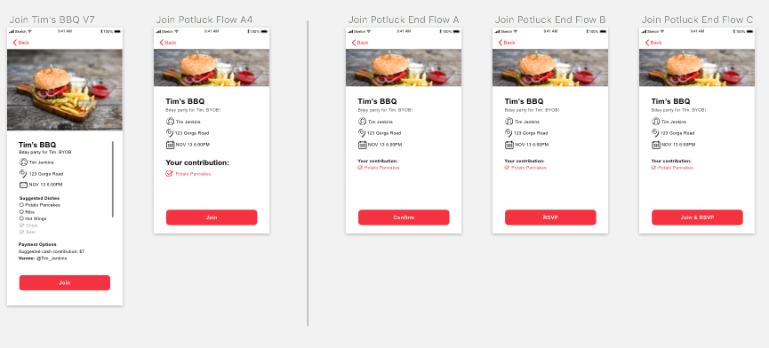
 Explorations for Potluck Confirmation Screen
Testing revealed that users were very confused upon seeing the word “Join” at both the beginning and the end of the flow. Most users did not end up clicking the final join button, or were very hesitant and anxious. I explored changing the content of the start and end buttons. Ending the flow with “Confirm” reinforces the user’s attendance and contribution method.
Solution
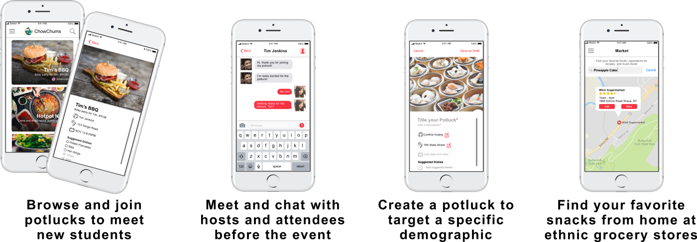
Our app, which we called ChowChums, aims to strengthen cultural and social dynamics through shared food experiences. International students will be able to meet and befriend other students, adjust to American culture, and improve on social and communication skills.
 Key Features of ChowChums
What I learned
- The classroom setting focused on applying concepts rather than shipping products. This project had a theory and research approach to the design process. In future projects, I anticipate working with and adapting this method to fit my needs.
- The designer is not the user. Arguments that start with “This is what I would do…” or “If I were using this…” are not justifiable, and it felt rather disconcerting to even say it. Design decisions should be backed up by tangible contexts like user evaluation and personas, or design best practices and HCI theory.
- Communication, Communication, Communication Its the most important thing when it comes to group work. Learn how to communicate your ideas and opinions, support them with sensible arguments and testable solutions.
Looking Forward
University is the best time to meet others with diverse experiences, and food experiences are a universal way to connect with people from other cultures.
Yet, this application merely affords creating and sharing potlucks. We can explore how the design of the app might address the awkwardness around meeting strangers in person, and how ChowChums can facilitate cultural learning, such as meal-time etiquette. If this application were to be implemented, we’d need to explore how grow a large user base, and encourage students to actively host and attend. And how might this app work with user’s existing social and communication platforms like Facebook? ChowChums is just the first step in addressing the various social and cultural problems that international students face.