Client: The Cornell Daily Sun
Tools: Sketch, Invision, Zeplin, Abstract, Google Suite, Dropbox
Involvement: I was one of two product designers for this project. I helped lead our user research initiatives, including recruitment, survey design, interviews, and later, testing. I worked on the information architecture and navigation of the app, as well as the notification and onboarding features. We worked with a team of 4-6 developers
The Challenge: I aimed to design and prototype a mobile app for The Cornell Daily Sun that would engage current and new audiences.
The Outcome: We worked with an agile team that iterated on design and development simultaneously over one and a half years. We worked closely with stakeholders at The Sun to create an app that would fit within The Sun’s brand and model, from design decisions to marketing. The iOS app is available now on the app store!
About The Sun
The Cornell Daily Sun is Cornell’s oldest and only independent, student-run newspaper. It reports on events at Cornell, in Ithaca, or related to Cornellians. The goal of this project was to create an iOS app for The Cornell Daily Sun that would retain and engage current and prospective readers of The Sun. We believed a mobile application was a necessary and progressive extension of The Sun’s current print and web platforms, as it provides a much more direct access to The Sun’s news content.
Discovery Phase
During the first phase of our design process, we wanted to get to know our users, the readers of The Sun, as well as the stakeholders- the paper’s Editorial Board.
Our Users: Readers of The Sun
In the first round of interviews, we sought to understand the behaviors of the readers of The Sun. We asked them what platforms they used, how often they read, how they browse, in what contexts and settings they read, and what were their motivations for reading. We also wanted to find out why people do not read The Sun and how an app might influence how people read.
In addition to contextual interviews, we created a survey using Google forms in order to gather qualitative and quantitative data on a larger group.
We recruited participants for this survey by:
- Advertising in the email newsletter sent to the digital subscribers of The Sun
- Posting in various Cornell Class and Alumni groups on Facebook
Stakeholders: The Editorial Board
We met with various members of the Editorial Board, including the Managing Editor, Design Editor, and Web Editor. We wanted to ensure that their needs and expectations of the app were met. We also wanted to get a better understanding of how the app would fit within the larger context of The Sun.
Throughout the whole design and development process, we continued to meet with Editorial Board members. Our discussions included topics such as:
- Generating revenue from in-app advertisements
- Best practices for pulling articles from their Wordpress website
- Access to their readership for future user research and testing
- Maintaining visual brand through the app’s design
- Marketing the app
Decide
From Findings to Features
One goal of the first round of research was to identify the product features that would meet user needs. From our research, we identified the following features:
- Main Feed - View the latest news stories
- Section Feed - View stories by section
- Search - Use keywords to search through all stories
- Trending Topics - See a list of popular topics in news
- Bookmarks - Save a story for later
- Notifications - Receive a push notification for certain sections or types of stories
- Settings - Display, About The Sun, and all other information
Process
- Navigation: Building the app’s structure
- Onboarding: Getting users started
- Visual Design System: Crafting a cross-platform experience
Navigation: Building the app’s structure
My goal was to explore how a user can navigate the app. I wanted all of our features to be seamlessly accessible, while taking into consideration hierarchy of user actions, based on user tests. Prioritizing simplicity and intuition, I asked:
- What is the relationship between these features?
- How should these features be organized in a way that matches the user’s conceptual model?
I looked to both news apps and social media apps for inspiration. News apps would have similar content and features to the Daily Sun app, and thus would provide a good starting point. Social media apps are widely used among our potential users, and could provide unique inspiration to the traditional newspaper model.
 Navigation exploration on news and social media apps
As I explored different methods of navigation, I saw most apps used either a side menu _or a _bottom navigation bar or a combination of both. I created a pros and cons table to consider which would best fit our needs.
I also realized three of the features we defined earlier needed more clarity:
- Trending Topics- What does it mean for news to be “popular” or “trending”? When would users be interested in this information?
- Search- In what situations do users search? How often do they search? (And subsequently, how much hierarchy should the Search feature have?)
- Notifications- How should notifications be accessed? Could it be a setting of a personalized news feed? Or an item in the Settings menu? Could notifications be accessed in multiple locations?
In order to explore both the methods of navigation as well as the three features, I created four low-fidelity prototypes on Invision to test on users.
My objectives for this round of user testing were
- To identify priority features (from Main Feed, Section Feed, Search, Trending, Bookmarks, Notifications, Settings) based on how user’s read news on apps
- To understand how and to what degree users want to control notifications on news apps
- To understand why users would use a search function
For an indepth look at the testing system I used, see this document.
A summary of my user research is presented below:
- Navigation: A majority of users liked the bottom navigation bar so that they could see all the features that could be accessed. We also saw many tech/social media apps have this navigation method, and thought it would be “on trend” with other apps.
- The Main Feed is the most important feature of the app. Users wanted to read what The Sun was reporting on, rather than specific interests or topics.
- Search: Many users don’t normally search for news, and if they hear of something that’s been talked about a lot lately, they just look to the home/main feed. Nevertheless, it’s a standardized feature, and something users don’t think about when they don’t need it, but when they need, it should be there.
- Notifications: I learned that notifications don’t_ need to be as easily accessible_ as we originally thought. Nearly all users would navigate to Settings in order to set Notifications. Setting up notifications only needs to be set up once and wouldn’t be frequently returned to.
- Trending/Popular: Users did not like a personalized news feed based on interests. Perhaps the scope of stories on The Sun is not wide enough that this feature would be necessary. Seeing what is “trending” would be interesting, but perhaps unnecessary.
After deciding on the bottom navigation bar as the method of navigating the app, we could layout the structure and the relationship between the app’s features. Clarifying users behaviors around Search, Notifications, and Trending/Popular News early on helped us refine these features later on.
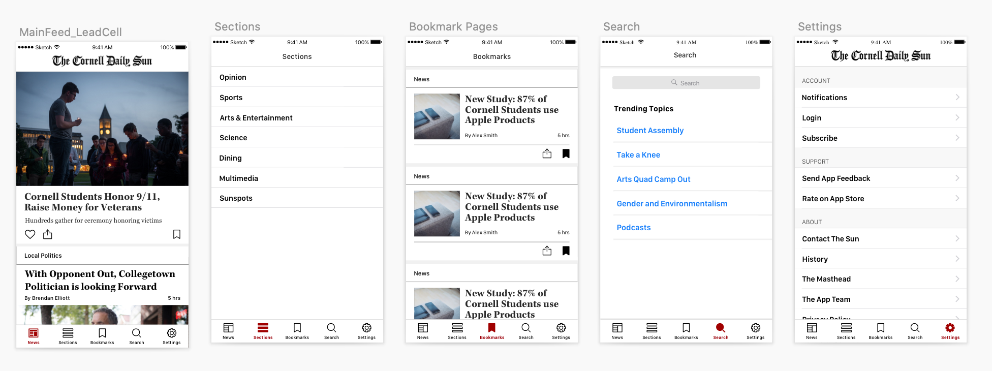 Mockup of Navigation Prototype: Final bottom bar navigation with five menu items: Main Feed, Sections, Bookmarks, Search, Settings.
Onboarding: Getting users started
Goal: Determine whether to implement onboarding, what should be onboarded, whether to require login in onboarding, whether to require login for certain app features (bookmarks) or at all.
I was rather excited to tackle this design challenge, as I personally dislike most onboarding procedures that I have experienced. I decided to research the purpose and function of Onboarding from a user experience and usability perspective.
Research & Inspirations
To log in or not to login?
We met with our development team to get a better understanding of the process of logging in from the developer side. I learned that while saving articles and user preferences can be done without a login (via “anonymous tokens”), it is much better to be done with a login, so that data can sync across multiple devices or so that data is saved in the event that the device is lost.
From my research, I learned that logins are typically required for e-commerce (ex. Amazon) or subscription based products/services (ex. The NY Times). Users cannot fully access and use these services without first creating an account and logging in. The Nielsen Norman Group refers to this as the Login Wall and according to their usability heuristics, “sites should use them only if users will benefit significantly from the presence of these walls”. For e-commerce sites, users cannot purchase anything without creating an account. These sites also provide the ability to save user data (previous purchases, bookmarked articles.)
The Cornell Daily Sun App does not require a subscription for reading. Personalized data would mean integration with one’s existing subscription and the desktop site, which doesn’t currently require a login. I decided against having a login for the Daily Sun App.
The Why and How on Onboarding
In general, the purpose of user onboarding is to show the user how this product will satisfy the user’s desire. The key is understanding who the user is, as well as their desire: why are they interested in this product, what are their motivations or pains? The app’s opening screen and onboarding process is the first step, and therefore the most crucial, in maintaining the user’s interest and retention.
I liked this piece of advice from Upland Localytics:
Do→Show→Tell
Engage the user instead of simply informing them and show (images/illustrations are better than text) them the value of the product. “People don’t care about features - they care about what they can do with those features” And this makes users feel as though onboarding is not a waste of time.
I also looked at a collection of Onboarding flows on User On Board for research and inspiration.
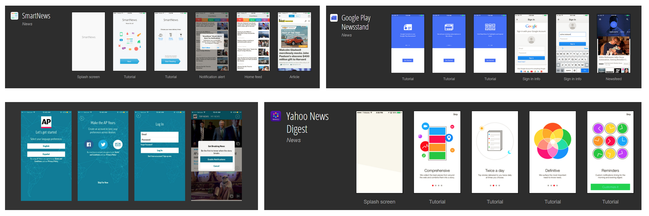 Onboarding Inspiration
Design Explorations
 Onboarding Exploration
In addition to exploring the UI and user flow, I asked what content is most effective in getting users to start the onboarding flow? A table of my explorations are shown below:
| 1. Customize Notifications/News | Instruction: What are you interested in? What are your interests? Change later Action: Done, Next |
| 2. Set up Notifications | Action: Send me Updates, Turn on notifications, make sure you don’t miss important news |
| 3. Skip | Action: Maybe later, No thanks, Not now, Nah, Skip for now |
Design Iterations and Decisions
I recalled from my research earlier that the overwhelming majority of users are more interested in headline news than specific sections. Thus I decided to give the user the option to opt in to “Breaking News” in the onboarding, and allow them to explore turning on notifications for specific sections later on in the Settings menu. The flow for the Onboarding would be:
| Load Screen | → | Value Proposition | → | Confirm/Deny Breaking News Notifications | → | First screen of App (Main Feed) |
In addition to making the onboarding useful and functional, I wanted it to be a fun and delightful experience for the user. It should be something that greeted the user and gave the app character. I played with the idea of having illustrations and images that would connect users to the Cornell campus, and give a sense of belonging to the Cornell community. I chose to illustrate Klarman Hall, as it is one of the main meeting locations for the Editorial Board of The Daily Sun. The second illustration is of the Cornell Clocktower and Uris Library, which is not only an icon of Cornell’s campus, but also the view from the window of the room where our app team would meet.
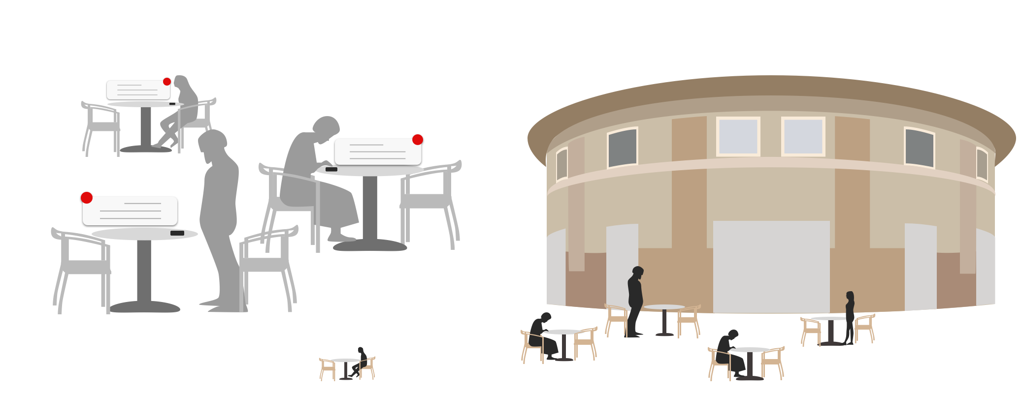 Digital notebook illustration of Klarman Hall
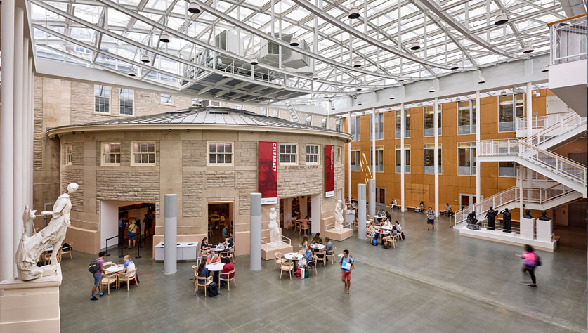 Klarman Hall. image credit: For Build Welliver from https://www.buildwelliver.com/projects/cornell-university-klarman-hall-humanities-building/
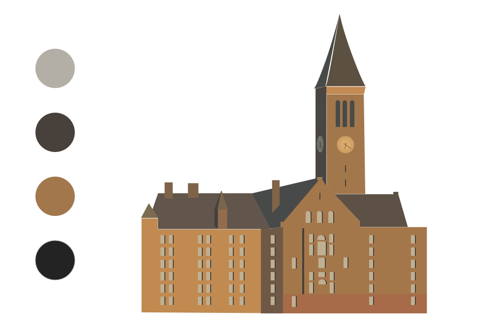 Digital notebook illustration of the Cornell Clocktower
 Cornell University Clock Tower. image credit: By Cornell010 at the English language Wikipedia, CC BY-SA 3.0, https://commons.wikimedia.org/w/index.php?curid=16963761.
My last iterations explored the interaction of the user flow: how would users go to the next screen? I designed various buttons and arrows to explore this interaction.
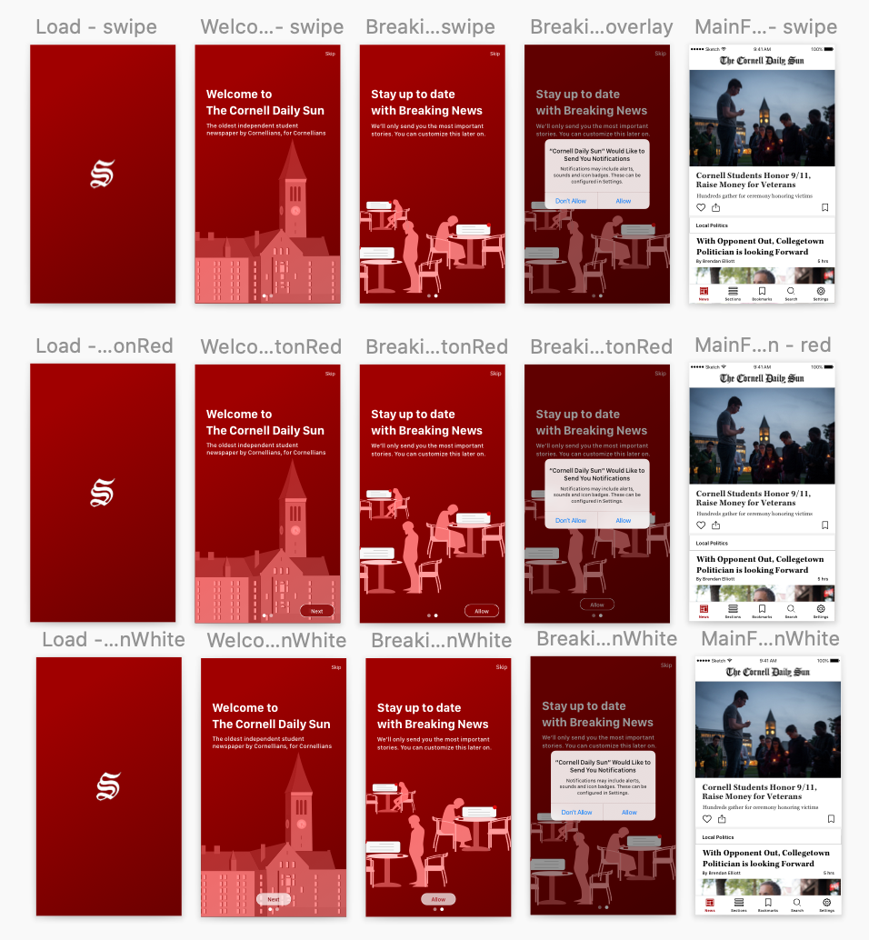 Iteraction exploration
Final Design
Although I was skeptical at first about Onboarding for The Daily Sun App, I believe the outcome is simple and effective for new users. It accomplishes two main goals: introducing the value proposition of the app and offering Breaking News Notifications, while also connecting to users to a sense of place.
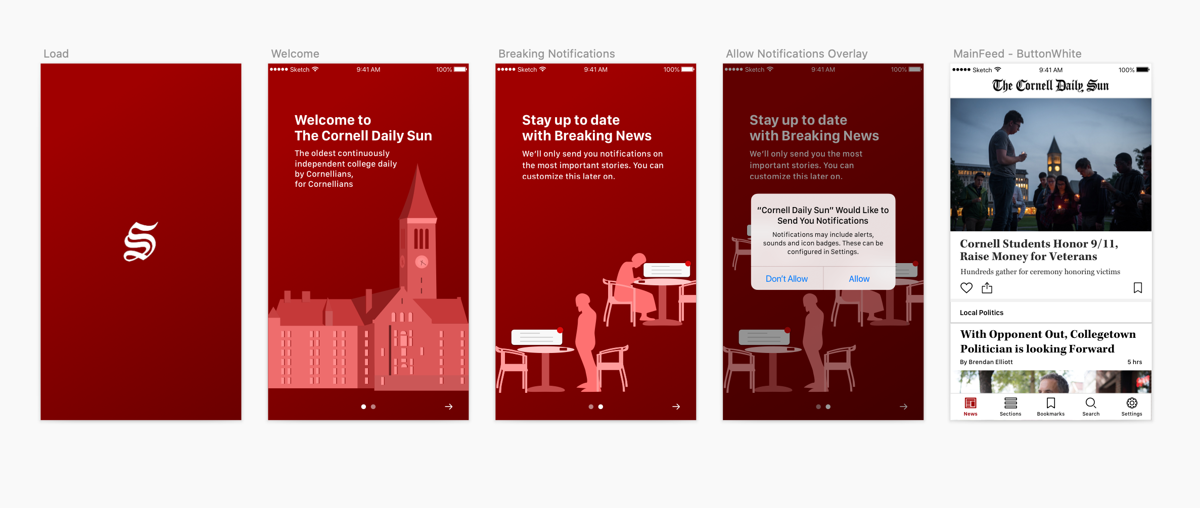 Final onboarding flow
Visual Design System: Crafting a cross-platform experience
We stitched all of our screens and features together by creating a cohesive visual design system that referenced The Sun’s existing design. In addition to the print newspaper, The Daily Sun has a website and email newsletter.
When we began high-fidelity iterations, we met with the Managing Editor and Design Editor of The Sun so they could share with us the design elements. I also expressed interest in creating icons for their newspaper’s sections in order to visually communicate what those sections would be about.
 Style guide
![]() Section icons
Section icons
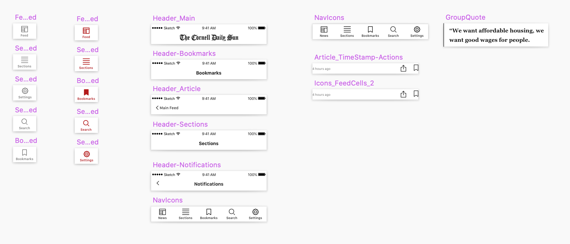 Headers and navigation icons